Part 1: Why Most Websites Fail to Convert — Even With Good Traffic
Getting traffic is easy.
Converting traffic is hard.
Thousands of businesses invest heavily in SEO, paid ads, and social media campaigns — only to struggle with poor results. The real issue isn’t traffic. It’s website conversion mistakes that silently destroy performance.
If your visitors aren’t turning into leads or customers, your website is leaking revenue.
At iqbirds.com, we’ve analyzed hundreds of underperforming websites. In most cases, the problem isn’t the product. It isn’t the price.
It’s the experience.
In this guide, we’ll break down the 10 most critical mistakes that:
- Increase bounce rate issues
- Create major website UX errors
- Reduce trust and credibility
- Prevent you from increasing conversion rate
Let’s start with the foundation.
What Are Website Conversion Mistakes?
Website conversion mistakes are design, technical, messaging, or structural flaws that prevent users from taking action.
A “conversion” can be:
- A purchase
- A form submission
- A demo booking
- A consultation request
- An email signup
Every page on your website should guide users toward one clear action.
When that journey is unclear, slow, confusing, or overwhelming — conversions drop.
And most businesses don’t even realize why.
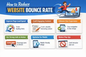
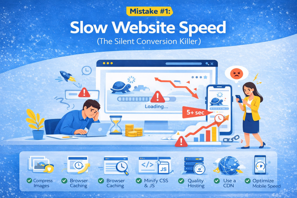
Mistake #1: Slow Website Speed (The Silent Conversion Killer)
Speed is not just a technical metric.
It’s a psychological trigger.
Studies consistently show that users expect websites to load in under 3 seconds. If it takes longer, frustration begins.
And frustration leads to exits.
Why This Kills Conversions
- Users lose patience
- Trust decreases
- Bounce rate issues increase
- Google rankings drop
- Mobile users abandon instantly
A slow website signals inefficiency. Even if your brand is excellent, speed shapes perception.
How to Fix It
To increase conversion rate, start with performance optimization:
- Compress large images
- Enable browser caching
- Minify CSS and JavaScript
- Use quality hosting
- Implement a CDN
- Optimize for mobile speed
Speed improvements alone can increase conversions by 10–30% in many industries.
Before you redesign anything — fix speed.
Mistake #2: Confusing Navigation Structure
When users land on your website, they ask one question:
“Where do I go next?”
If your navigation is cluttered, unclear, or overwhelming, users don’t explore.
They leave.
Confusing menus are one of the most common website UX errors that destroy user flow.
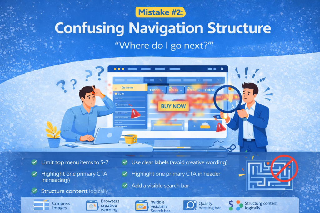
Signs Your Navigation Is Hurting Performance
- High homepage exit rate
- Low average session duration
- Users rarely reaching product/service pages
- Heatmaps showing random click behavior
Why It Happens
Many websites try to show everything at once:
- Too many menu items
- Too many dropdowns
- Poor category structure
- No clear priority
Clarity converts. Complexity confuses.
How to Fix It
- Limit top menu items to 5–7
- Use clear labels (avoid creative wording)
- Highlight one primary CTA in header
- Add a visible search bar
- Structure content logically
Navigation should feel intuitive — not like a maze.
When users instantly understand your structure, trust increases.
And trust increases conversions.
Mistake #3: Weak or Generic Call-to-Action (CTA)
Your CTA is the turning point.
If it’s weak, everything else collapses.
Many businesses use vague CTAs like:
- Submit
- Learn More
- Click Here
These are passive. They don’t communicate value.
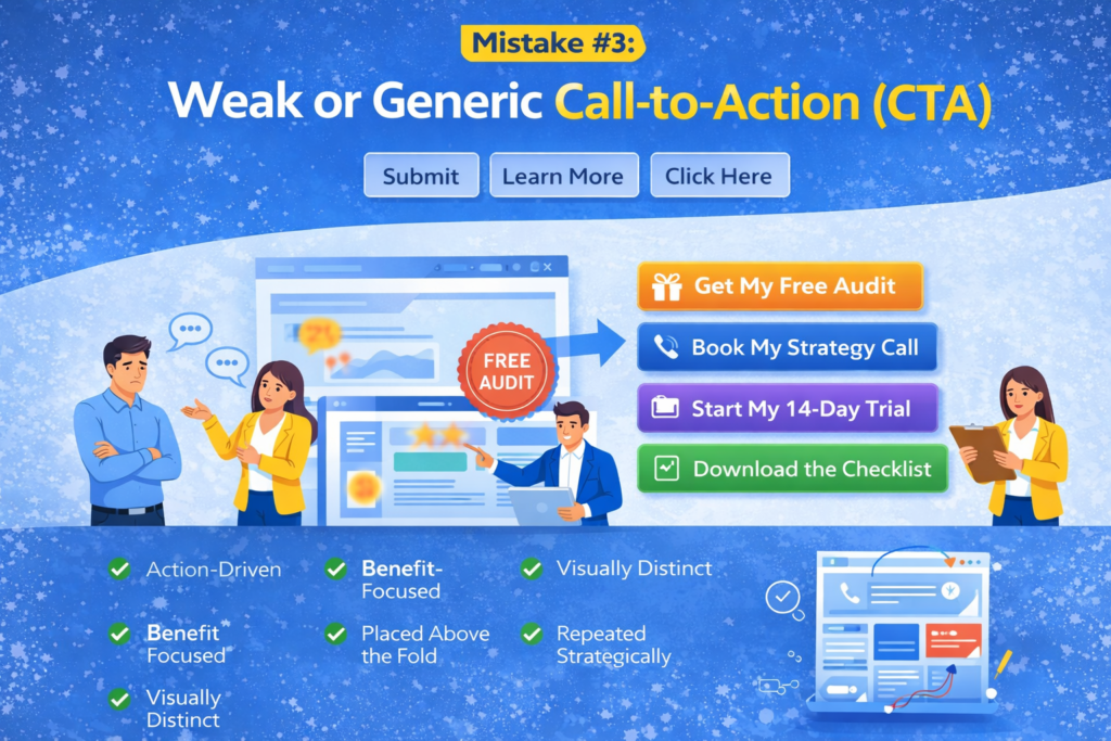
Why This Is a Major Website Conversion Mistake
Visitors don’t act because you ask them to.
They act because they see benefit.
A strong CTA answers:
- What do I get?
- Why should I act now?
- What happens next?
How to Improve Your CTA
Instead of:
“Submit”
Use:
- Get My Free Audit
- Book My Strategy Call
- Start My 14-Day Trial
- Download the Checklist
Make your CTA:
- Action-driven
- Benefit-focused
- Visually distinct
- Placed above the fold
- Repeated strategically throughout page
CTA optimization is one of the fastest ways to increase conversion rate without increasing traffic.
Why Most Businesses Don’t Notice These Problems
Because traffic feels like progress.
You see visitors increasing in analytics and assume growth is happening.
But if conversions aren’t increasing at the same rate, your website has structural problems.
And these website conversion mistakes compound over time.
That’s how businesses lose thousands in hidden revenue every month.
Mistake #4: No Social Proof (Or Weak Social Proof)
Imagine walking into an empty restaurant.
No customers.
No reviews.
No testimonials.
Would you feel confident eating there?
Probably not.
The same psychology applies online.
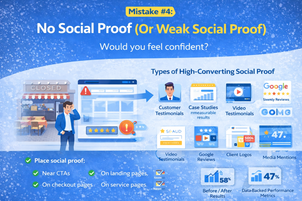
Why This Is One of the Biggest Website Conversion Mistakes
People trust people more than brands.
Without proof:
- Your claims feel unverified
- Your expertise feels unproven
- Risk feels high
And when perceived risk is high, conversions drop.
Types of High-Converting Social Proof
To increase conversion rate, include:
- Customer testimonials (with real names & photos)
- Case studies with measurable results
- Video testimonials
- Google reviews
- Client logos
- Media mentions
- Before/after results
- Data-backed performance metrics
The more specific your proof, the stronger the impact.
“Great service!” → Weak.
“Increased our leads by 47% in 3 months” → Powerful.
Quick Fix Strategy
Place social proof:
- Near CTAs
- On landing pages
- On checkout pages
- On service pages
Don’t hide it on a separate “Testimonials” page.
Trust must be visible at decision points.
Mistake #5: Poor Mobile Optimization
Over 60% of traffic today is mobile.
Yet many websites are still designed primarily for desktop.
This creates massive bounce rate issues.
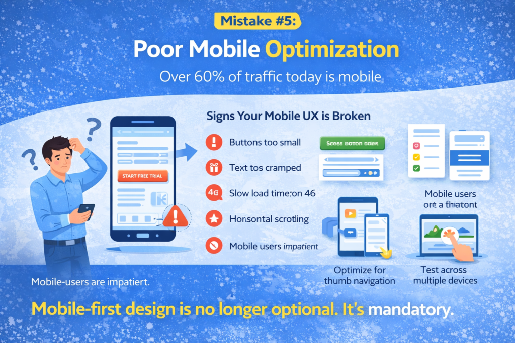
Signs Your Mobile UX Is Broken
- Buttons too small
- Text too cramped
- Slow load time on 4G
- Forms difficult to complete
- Horizontal scrolling
Mobile users are impatient.
If they struggle, they leave.
Why This Hurts Conversions
Mobile friction increases cognitive load.
When users must zoom, scroll excessively, or adjust orientation, they mentally disengage.
And disengaged users don’t convert.
How to Fix It
- Use responsive design
- Increase button size
- Simplify forms (fewer fields)
- Optimize for thumb navigation
- Test across multiple devices
- Compress mobile images
Mobile-first design is no longer optional.
It’s mandatory.
Mistake #6: Too Much Information (Overwhelming Visitors)
Many businesses believe more content equals more persuasion.
That’s incorrect.
Too much information creates decision paralysis.
When users feel overwhelmed, they postpone action.
And postponement often turns into abandonment.
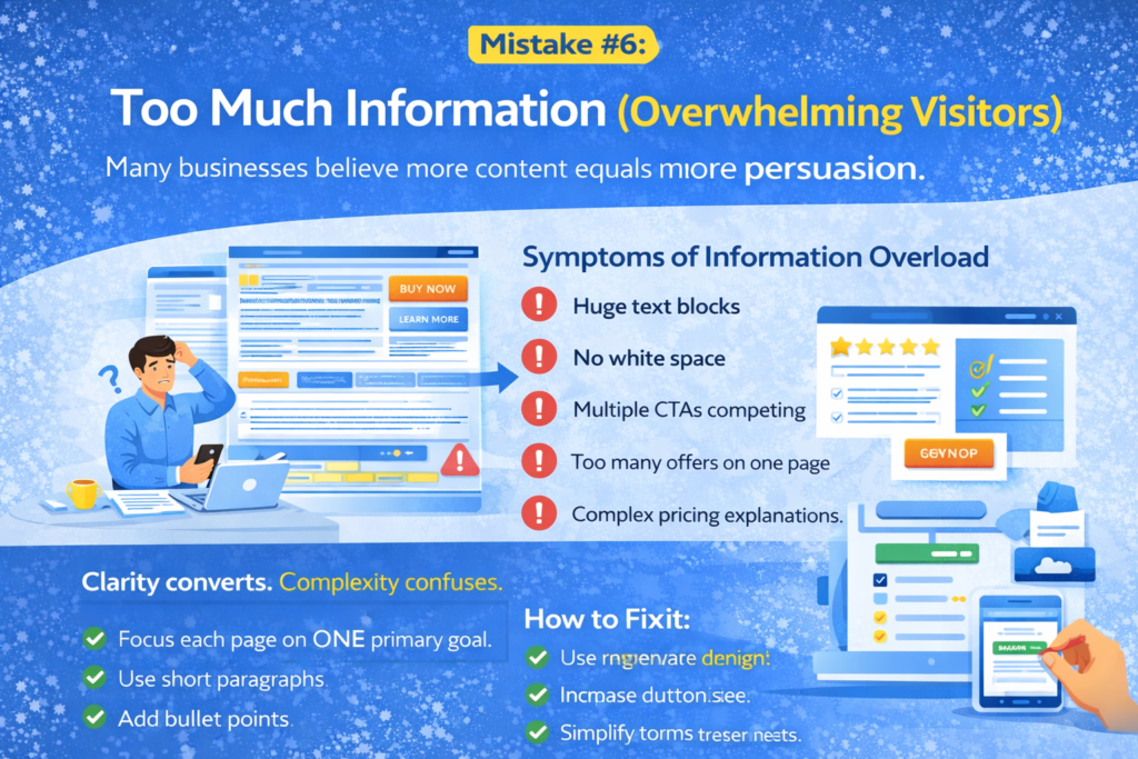
Symptoms of Information Overload
- Huge text blocks
- No white space
- Multiple CTAs competing
- Too many offers on one page
- Complex pricing explanations
Clarity converts.
Complexity confuses.
How to Simplify for Higher Conversions
- Focus each page on ONE primary goal
- Use short paragraphs
- Add bullet points
- Highlight key benefits
- Remove unnecessary distractions
Remember:
Your website is not a brochure.
It’s a conversion system.
Mistake #7: Lack of Clear Value Proposition
Within 5 seconds of landing on your site, visitors should know:
- What you do
- Who it’s for
- Why it matters
If that’s unclear, they leave.
This is one of the most expensive website conversion mistakes because it affects every page.
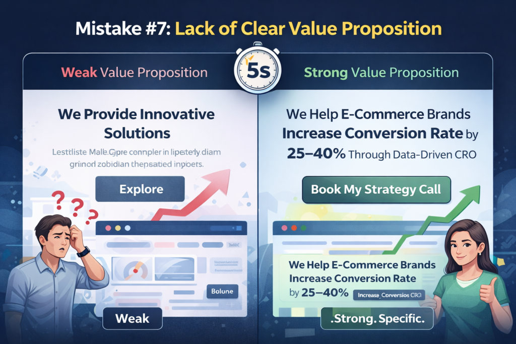
Weak Value Proposition Example
“We Provide Innovative Solutions”
Innovative how?
For whom?
What problem do you solve?
Strong Value Proposition Example
“We Help E-Commerce Brands Increase Conversion Rate by 25–40% Through Data-Driven CRO.”
Specific.
Clear.
Outcome-focused.
How to Improve Your Value Proposition
- Focus on results, not features
- Speak directly to your target audience
- Highlight transformation
- Remove jargon
Your headline is not decoration.
It’s your conversion trigger.
Mistake #8: No Trust Signals on Key Pages
When users reach checkout, booking forms, or payment pages, doubt increases.
This is the highest-risk moment in the conversion journey.
Without trust signals, hesitation wins.
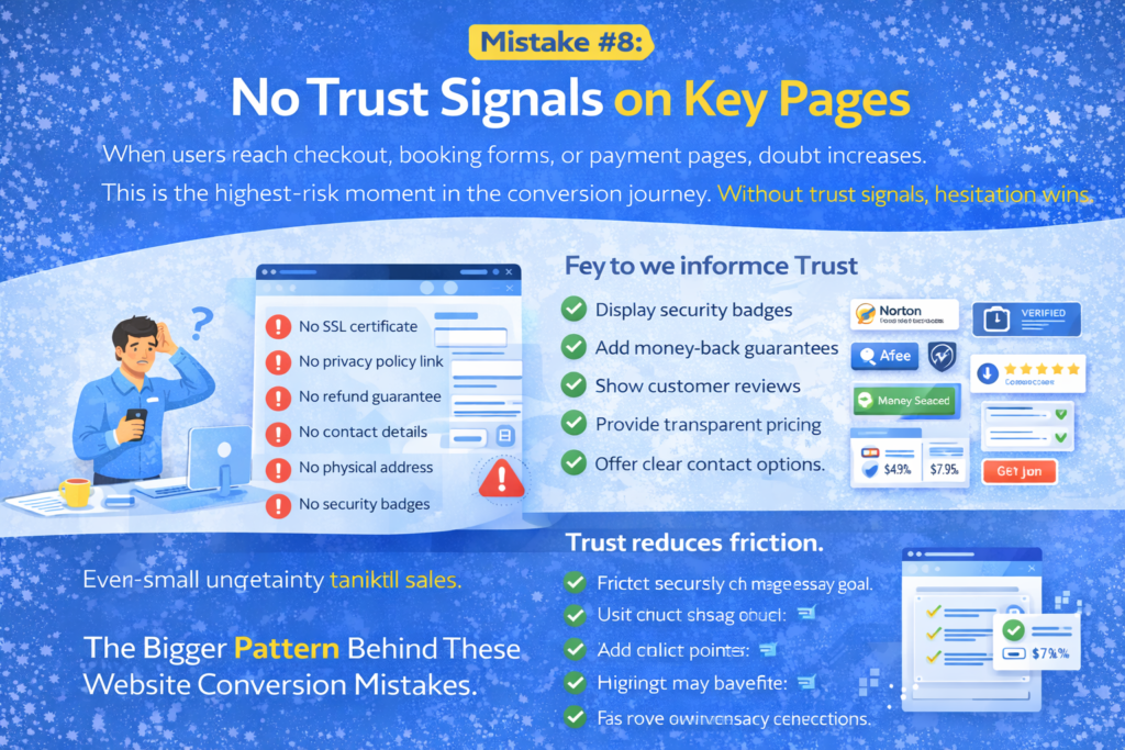
Missing Trust Signals Include:
- No SSL certificate indication
- No privacy policy link
- No refund guarantee
- No contact details
- No physical address
- No security badges
- No clear return policy
Even small uncertainty can kill sales.
How to Reinforce Trust
- Display security badges
- Add money-back guarantees
- Show customer reviews near checkout
- Provide transparent pricing
- Offer clear contact options
Trust reduces friction.
Reduced friction increases conversions.
The Bigger Pattern Behind These Website Conversion Mistakes
Look closely at all the mistakes so far.
They share one root problem:
Friction.
Friction increases bounce rate issues.
Friction creates doubt.
Friction kills momentum.
Your goal is simple:
Remove friction at every stage of the user journey.
When friction drops, conversions rise naturally.
Mistake #9: No Conversion Tracking or Data Analysis
You cannot increase conversion rate if you don’t measure it correctly.
Many businesses:
- Track traffic but not behavior
- Track clicks but not intent
- Track sales but not drop-offs
Without data clarity, optimization becomes guesswork.
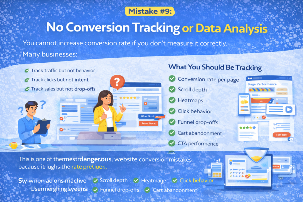
What Happens Without Tracking?
- You don’t know which pages cause bounce rate issues
- You can’t identify form abandonment
- You don’t see friction points
- You waste money on ineffective marketing
This is one of the most dangerous website conversion mistakes because it hides the real problem.
What You Should Be Tracking
- Conversion rate per page
- Scroll depth
- Heatmaps
- Click behavior
- Funnel drop-offs
- Cart abandonment
- CTA performance
- Mobile vs desktop conversion gap
When you measure properly, patterns emerge. And patterns lead to precision improvements.
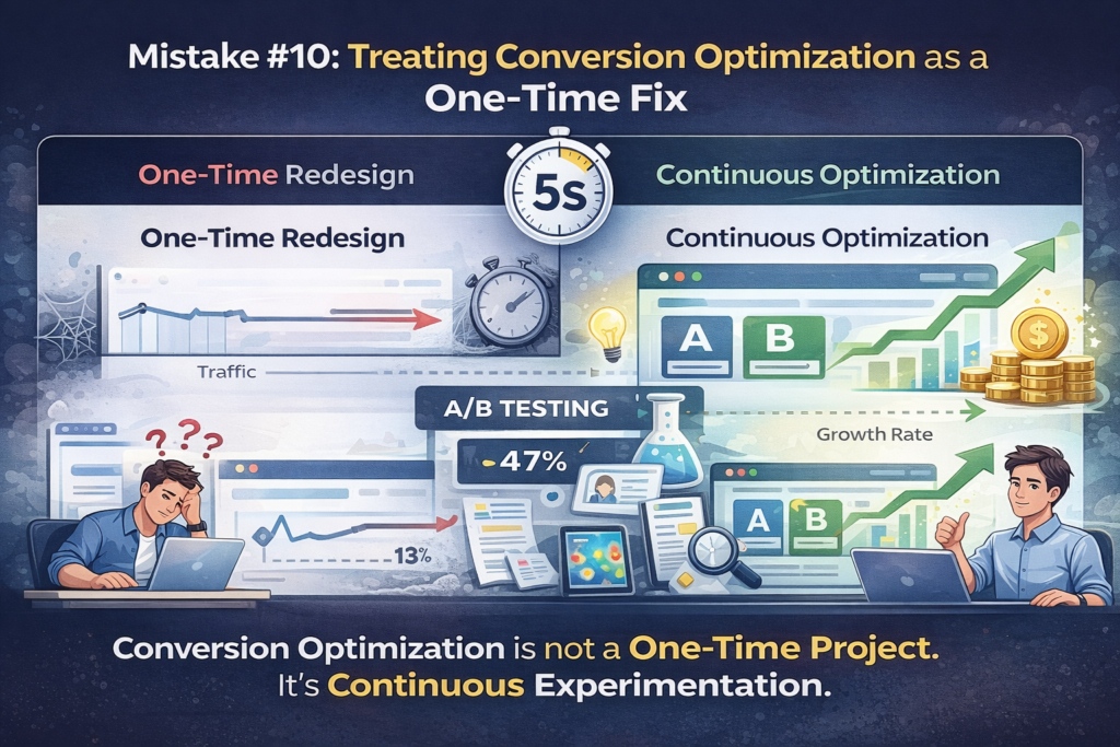
Mistake #10: Treating Conversion Optimization as a One-Time Fix
This is where most businesses fail.
They redesign once.
They tweak a CTA.
They adjust colors.
Then they stop.
But user behavior changes.
Markets evolve.
Competitors improve.
Conversion optimization is not a project — it’s a continuous growth strategy.
Why This Kills Long-Term Conversions
If you don’t continuously test and refine:
- Your bounce rate issues return
- Your messaging becomes outdated
- Your UX falls behind competitors
- Your offers lose urgency
Websites that win treat optimization as ongoing experimentation.
What Continuous Optimization Looks Like
- A/B testing headlines
- Testing CTA variations
- Refining offers
- Improving page layout
- Analyzing user recordings
- Updating messaging quarterly
The difference between average and high-converting websites is consistency.
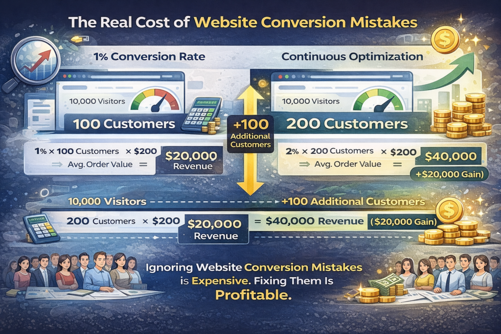
The Real Cost of Website Conversion Mistakes
Let’s put this into perspective.
If you get 10,000 visitors per month and convert at 1%, you get 100 customers.
If you increase conversion rate to just 2%, you get 200 customers.
That’s 100 additional customers — without increasing traffic.
Multiply that by your average order value, and the revenue gap becomes massive.
Ignoring these website conversion mistakes is expensive. Fixing them is profitable.
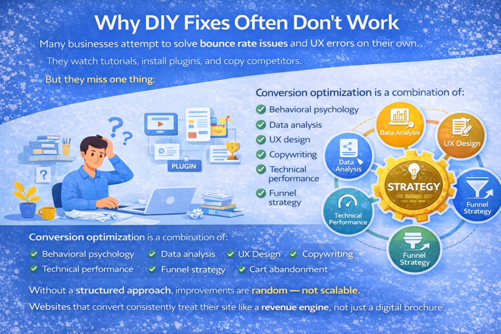
Why DIY Fixes Often Don’t Work
Many businesses attempt to solve bounce rate issues and UX errors on their own.
They watch tutorials, install plugins, and copy competitors.
But they miss one thing:
Strategy.
Conversion optimization is a combination of:
- Behavioral psychology
- Data analysis
- UX design
- Copywriting
- Technical performance
- Funnel strategy
Without a structured approach, improvements are random — not scalable.
Websites that convert consistently treat their site like a revenue engine, not just a digital brochure.
Powerful Conclusion: Your Website Is Either Converting — Or It’s Leaking Money
Here’s the hard truth.
Your website is not neutral.
It’s either:
- Turning visitors into revenue
OR - Quietly leaking potential customers every single day
Every slow page, weak CTA, confusing layout, and missing trust signal compounds. And over time, they cost you thousands — sometimes millions — in lost opportunity.
The good news? Every single website conversion mistake discussed here is fixable.
When you:
- Eliminate website UX errors
- Remove friction
- Strengthen trust
- Optimize mobile experience
- Clarify your value proposition
- Track real data
- Commit to continuous improvement
You don’t just increase conversion rate — you transform your website into a predictable growth system.
At iqbirds.com, we believe your website should work as hard as you do.
Traffic without conversions is vanity.
Optimized conversions are sustainable growth.
If you’re serious about scaling your business:
- Fix the leaks
- Remove the friction
- Build trust
- Optimize continuously
And turn your website into the revenue engine it was meant to be.